In one of the speeches, Elon Musk stated that humanity is already merging with machines on a far greater level than one might think. Of course, he meant our close-to-physical dependency on handheld devices and the services they provide for our daily routines.
A mobile UX design guide is a roadmap for mobile app developers and designers in creating paths for users to interact with complex systems and concepts. Whatever your app design idea is, it’s worth something only if the user is able to easily comprehend it and apply to the benefit.
In this abstract, we’ll answer some fundamental questions related to mobile UX and app design practices. We’ll cover the term GUI, talk about how mobile UX design elements affect the user journey, and give a general view of the importance of UI design for an app to succeed.
Mobile dominating desktop
Starting from the year of 2015, the trend of using mobiles to connect to the Internet has never stopped. By the middle of 2022, the global share of web traffic on mobile devices exceeded the figure of 60%.
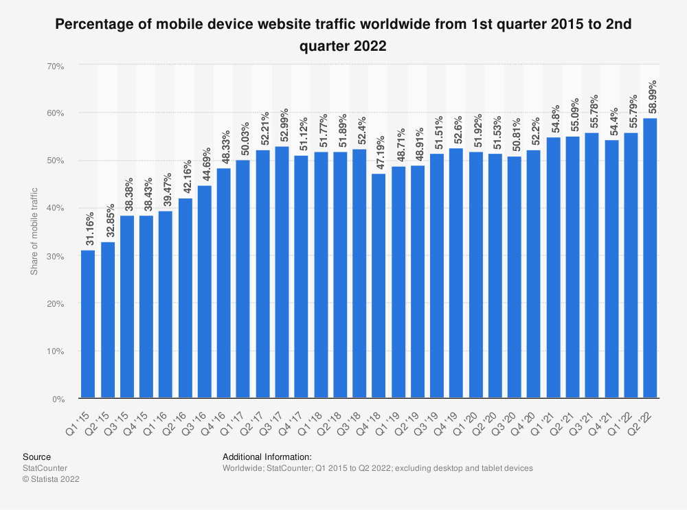
It doesn’t mean that mobiles will necessarily exclude classic desktops from the horizon. But it means that web design principles are transforming to satisfy the growing demands and meet the requirements of mobile UX best practices.
So why is the user interface so important? And what should be considered in mobile app development to satisfy a mobile user?
Let’s discuss some aspects related to mobile UX design in the following sections.
GUI in a nutshell
Before moving to the best mobile UX design practices, let’s quickly refresh our knowledge on the user interface as a whole.
A GUI (graphical user interface) is a system of interactive visual components for computer software. A GUI displays objects that convey information and represent actions that can be taken by the user. The objects change color, size, or visibility when the user interacts with them.
The basic elements of GUI include:
- Button
- Dialog box
- Icon
- Menu
- Tab
- Toolbar
- Window
All these graphic elements interact with users and one another to carry out commands and visualize data.
To be honest, the majority of systems can operate and stay fully functional even without graphical interfaces. But their presence makes the user experience more friendly and intuitively understandable. It’s hard to imagine an average person using a command line instead of Google Chrome to surf the net.
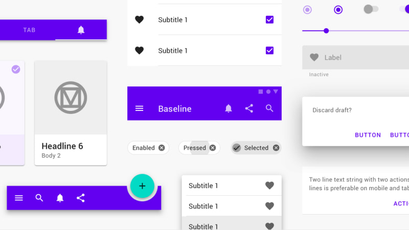
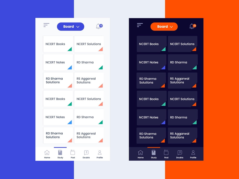
On the image below, you can see interactive building blocks for creating a mobile user interface, components by Material Design.
And now, let’s have a closer look at what mobile UX actually is and which challenges it sets for a UX designer.
A general mobile UI/UX design guide: Mobile fundamentals & app development considerations
What can you do in 2022 with your mobile only?
You can instantly communicate with your family and friends, order food or taxi, book accommodation or tickets to any transport (except for spaceships, but it’s ahead for sure), hold meetings, track calories, and the whole nine yards. Basically, you can retrieve any aural and visual information from the global network for your needs.
All these wonders are possible via simple mobile apps that are installed with only a few presses of your fingertip on a touchscreen. Let’s figure out what makes the magic of mobile UX real.
We’ll try to see things from the perspective of a UI/UX designer who knows how to put oneself in users’ shoes.
In other words, look at this guide not exactly as an end-user but more like a qualified mobile app designer who knows what users need for each particular purpose.
The introduction to mobile UX
Firstly, never forget the fundamental term before starting the app development process to deliver a high quality user experience:
User experience (UX) in mobile refers to the overall experience a person has interacting with any type of mobile device (phone, tablet, wearable).
In this text, we’ll be mostly referring to the frontend mobile design UX features. And mobile phones will be our target device, as the majority of app development efforts and user experience design services are for phone owners.
Layout is the basis
Regardless of the target audience, contents, or goals of a mobile application, layout dictates the standards of app design for the interaction of a user and a product.
Before starting the UX design process, always keep in mind that the phone screen is limited and isn’t able to showcase the same amount of features as the desktop at one time. Moreover, navigating with a mouse or keyboard, obviously, isn’t the same as using a fingertip to interact with design elements.
With that said, here are some universal mobile UX characteristics that can’t be avoided:
- The size of touchscreen targets should be 5-10mm
Any basic UX research will show that such a size allows a mobile user to tap the needed UI design item without aiming too carefully. If one misses the spot regular enough, it evokes the feeling of irritation and discourages further product usage.
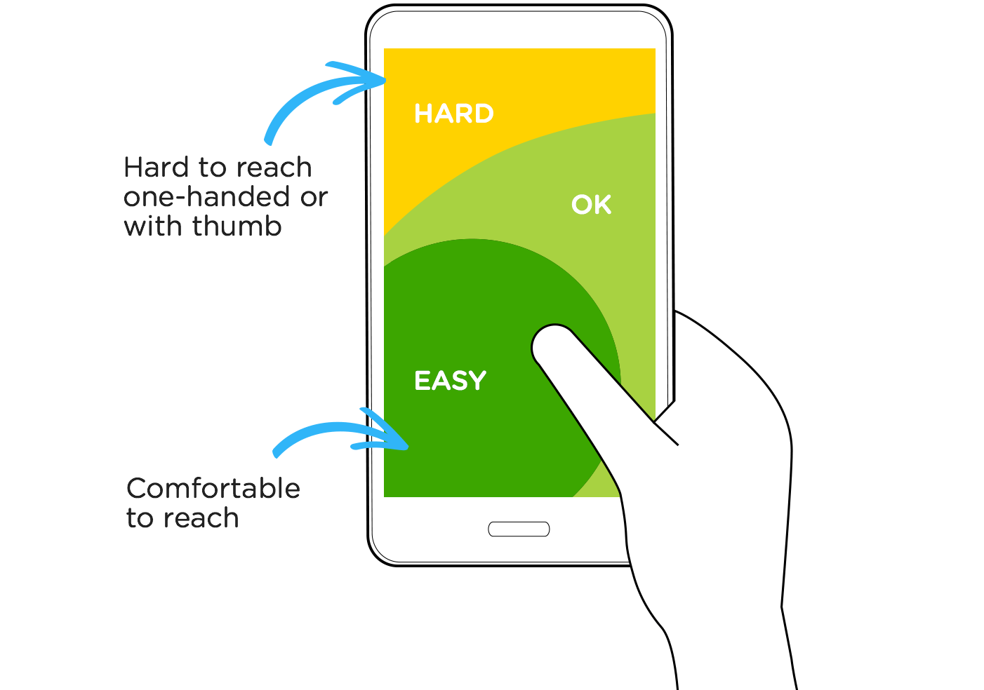
- Consider the hand position and the thumb zone
Using the thumb fingertip is not a strict rule for navigating in a mobile application. However, when holding a mobile with one hand, it’s the only option for convenient mobile UX. Be sure that the most crucial interaction points are located in the low and mid sections of the screen. It’s a solid standard for any mobile app development process.
- Ensure the minimized navigation and the related contents
What can a mobile user do to navigate on a mobile? They can tap, double-tap, and swipe from side to side or up and down. Seems like not much but enough for surfing around almost any content or even playing online games of any genre.
Minimized well-thought-out responsive layout design guarantees a positive mobile app UX and the wish to get to the product back again. We’ll cover some examples of such best practices later on.
And now, let’s move to the next point of app design basics that can’t be omitted while creating a good product in terms of mobile UX.
The visuals make the connection
Once again, we’re not talking about visuals in terms of color palette or the stylistic features to attract a certain audience. We’re covering omni-purpose UX features that are common for any top-quality product, be it a housewives’ cookery mobile application or a finance market condition tracker.
Respect the hierarchy of UI elements
Just like Renaissance artists knew how to manipulate the spectators’ view, meaning which spot to start looking at the painting, where to proceed, and where to finish, a crafty mobile app designer can do the same.
Here is the overall rundown of mobile UX guidelines that are based on every user experience research ever conducted:
- The larger the UI design element is, the more it’s associated with something important.
- Contrasted colors have a tremendous eye-catching effect in mobile app design.
- Closely-spaced and aligned UI design elements are related in the user’s eye.
- The more empty space there is around an element, the more significant it seems.
- Rich textures overshadow flat ones in mobile design.
Due to the limited screen space, a mobile app UI design has to clearly indicate which mobile UX design elements are the main ones, which play the supporting role, and which are hidden but still can be easily accessed when needed.
Show. Don't explain
The global network unites people, and the internet language has become a universal tool for mutual communication. Imagine that a mobile user is a tourist who came along to visit the virtual area of your app. Sure enough, you’d want anyone to feel comfortable and have positive feedback regardless of the culture or continent they were born in.
So never underestimate the power of emojis and universal symbols during the UX design process. The best apps are cross-platform, and the best appeals are cross-cultural. You’ll notice that for most of your mobile UX design functionality, no text is required at all. Plus, it will be easier to optimize such a valuable screen space for app design.
Leave some space for visual personalization
Interactivity is an essential component of any modern mobile UX design. To observe information, users have to perform some actions with UI design elements firsthand. Starting from installing a mobile app or getting access to its online version and finishing with inputting data and moving around its mobile UX design features.
But being able to switch visual UI design components according to one’s taste adds to the sense of ownership and belonging. So even the most basic options like switching between day/night modes or customizing major interface color gradients increase the chances of loyalty from users.
Notable cases of satisfying mobile UX design
So let’s cover some notable examples of existing products that managed to apply all the abovementioned mobile UX design features successfully.
YouTube
Let’s start with a household name that doesn’t require much presentation. A video-sharing platform that has gone far beyond its initial purpose. It combines the features of social media, video/audio sharing and streaming platforms, and has a far-reaching global impact, to say the least.
Fun fact. Once, the YouTube administration launched a prank that the whole network was owned by Snoop Dogg (a popular US rap star).
Their mobile app is a true state of the art in terms of app design. Here is how it generally works.
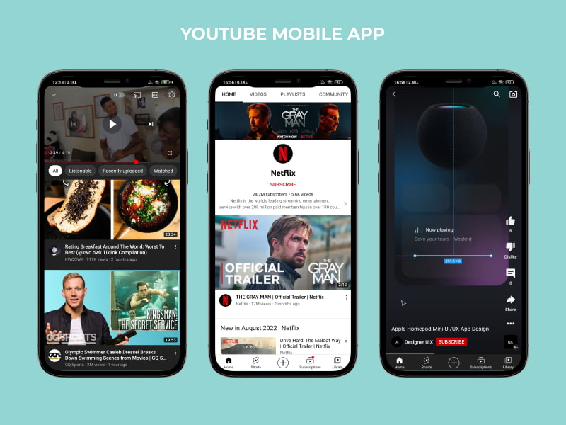
- The bigger part of the screen is occupied by video previews, the company’s main asset.
- The bottom navigation panel is for the main page, video shorts section (something like TikTok videos), ‘add video’ option, personal subscriptions, and library menus.
- The upper panel is for search, notifications, personal account icons, your video navigation preferences, and the brand logo.
- The page is refreshed by swiping down while at the top of the page, and various video previews are offered while swiping up.
There are plenty of additional hidden mobile UX features that can be discussed forever. But not today :)
What is for sure, the navigation is seamless. The branded color of red is present everywhere to some extent but still unintrusive. Even the pop-up commercials seem not so irritating and something that one can bear with. Well, what can you say about their mobile app design? YouTube is YouTube.
Spotify
Spotify is an audio streaming service from Sweden, one of the most musical countries in the world.
Fun fact. Spotify has over 50 million songs available, 25% of which have never been played.
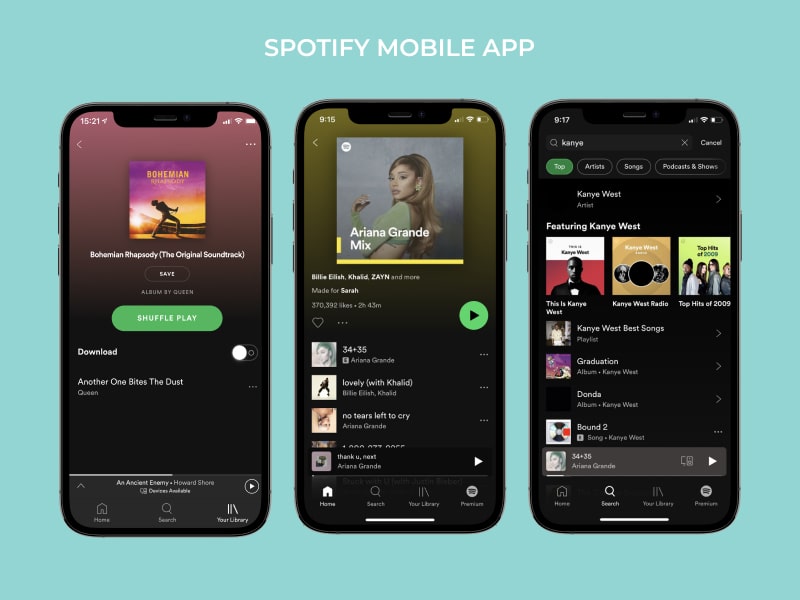
The app follows all the basic layout design canons, but the main interface is more fragmented than the YouTube app. Its logic and purpose are to fill the limited mobile screen with the lists of one’s most preferred playlists, recommendations, new releases, tops, genre-oriented selections, etc.
At the same time, it provides users with general information about artists, albums, accessible radio stations, and even song lyrics.
Their light-green logo color always appears in contrast to everything else, making it impossible neither to miss nor to forget. Truly, one of the best mobile UX design cases there is.
Diia
Diia is an ambitious project of the Ukrainian government aimed to simplify the majority of administrative services for citizens.
Fun fact. ‘Diia’ means ‘action’ in Ukrainian. It also serves as an acronym for ‘Derzhava i Ya’, which means ‘State and Me’.
The app was successfully launched in 2020 and has been expanding its functionality since then. Currently, Diia allows Ukrainians to use digital documents instead of physical ones and provides access to over 50 governmental services.
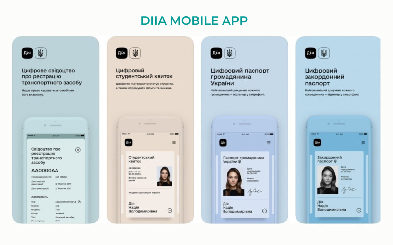
The visual design is minimalistic and couched in low-key gray, blue, green, and pink colors. The main screen showcases the documents and certificates like inner and foreign passports, vaccinations, driving licenses, etc. The navigation panel is at the bottom, which provides easy access to online government services and informative sections.
For the simplicity and efficiency of its mobile app design, Diia received the Red Dot Design Award in Essen, Germany.
&frankly
Another company from Sweden but not related to music this time. &frankly provides a cloud-based service tool for managers and employees. The purpose of the product is to ‘track the pulse’ of the working teams and keep their commitment and engagement on a high level.
The employees give responses to various categorized questions about their condition and working environment. The data is stored and processed in a secure database to later be formed in reliable employee survey results.
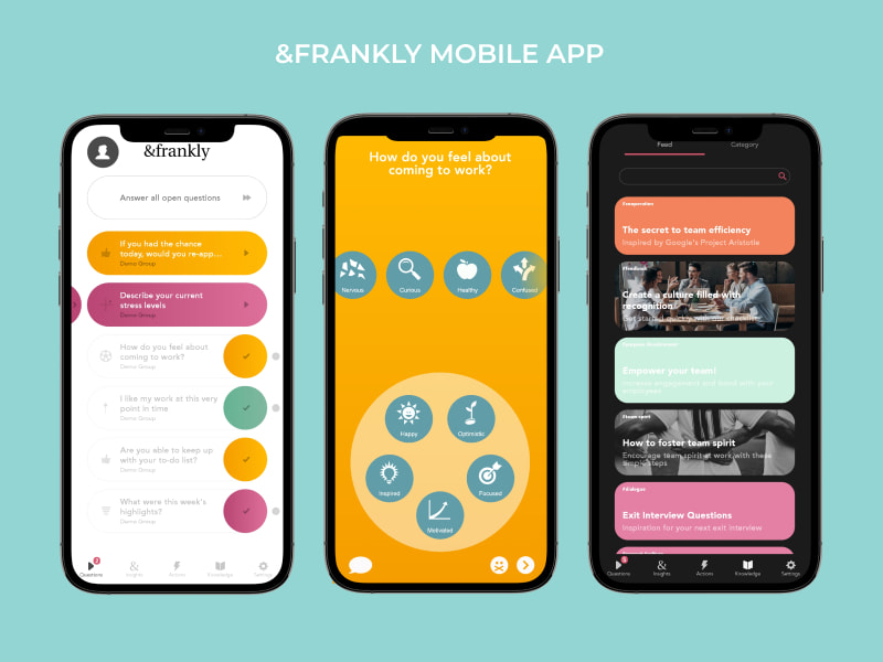
The interface is full of lively colors, while the navigation is intuitive and satisfying.
&frankly is an ongoing project. And Vilmate is glad to be assisting in its mobile app development process. Here is a short outtake from the founder’s feedback on our participation:
Final words
So this was a brief mobile UX design guide with some examples of successful implementations. We tried to cover the aspects which are inevitable for consideration regardless of mobile UX design trends and product specifications.
If you’re thinking about an iOS or Android app, check our mobile application development services and don’t put your ideas into cold storage. Also, look through our UI/UX design offers to make your user interface unique and correspond to modern best practices. We always apply mobile UX best practices in order to build a mobile app that would stand any competition in the field.
Stay tuned with Vilmate! And keep your mobile close :)


