Today, it is crucial for a business to have an established online presence, and creating a landing page is one of the best ways to achieve that.
In one of our previous articles, we discussed what a landing page is and why you might need one. So now, we would like to take a deep dive into how to create a landing page, what makes up a perfect landing page design and an effective landing page structure, and what landing page best practices one should follow to make the most of it.
Landing pages are mostly all about marketing and connecting with present and prospect customers, so it’s likely that it won’t be enough to use the same template as everybody else does. Besides, people tend to become ever more protective of their personal information year by year. Therefore, businesses should make every effort to encourage a user to share their contact information on their website.
That’s where landing page best practices come to the fore. The landing page’s structure, format, design, and content can all either catalyze or undermine its success. If handled wisely, they become a strong marketing tool that makes a page so targeted, appealing, and user-friendly that almost anyone will want to submit their information. Let’s find out what to keep in mind when creating a landing page to avoid a big failure and finally kick off your online marketing efforts.
Best practices: What makes a good landing page
Post-click landing pages are used to turn website visitors into leads by making them click through to a specific action. This short sequence of events constituting your early marketing funnel has the power to launch the user’s long journey with your brand. So, it is in your interest to design your landing page(s) so effectively to acquire and retain customers.
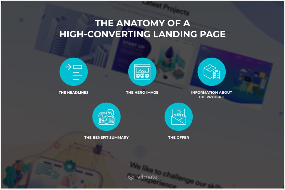
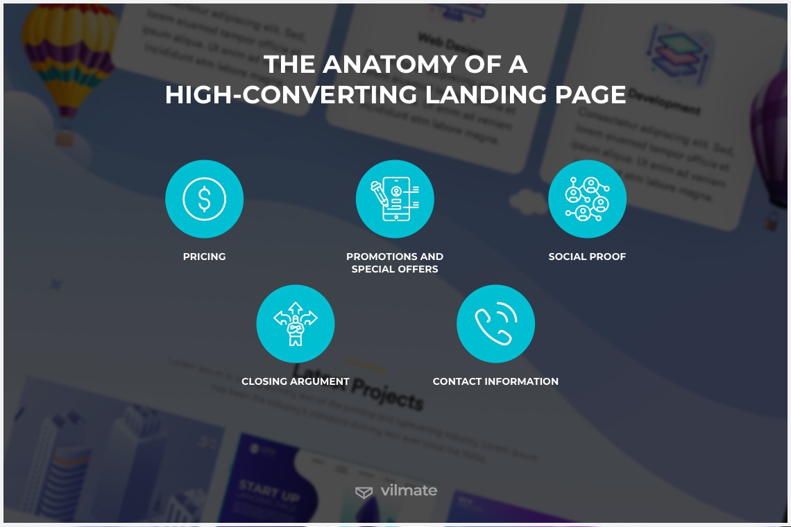
Before going into detail on the exact best practices to follow, the first thing to do is clarify what components the standard page structure must include. Let’s break it down into the key landing page sections and go over how to arrange them to align your landing page design with the anatomy of a perfect landing page.
-
The headlines: The first block ideally should consist of the main and supporting headlines. This is where the user gets to know the brand and its unique value proposition. One can often see a call-to-action button and the company logo here as well. Other information can be used in the headline section to improve navigation on the page for those who visit the page for the first time.
-
The hero image: A landing page should be, among others, pleasant to look at. Therefore, take it seriously what pictures you use there and make sure their quality and quantity are optimum for users to remain focused but not be distracted from the essential information.
-
Information about the product: You briefly and to the point tell users about your offer and showcase the photos supporting your statement for your future clients to have a complete picture of the product or service offering.
-
The benefit summary: In this section, you explain the advantages of your product or service and its differences from those of your competitors. It can contain a list of the reasons why the client should choose you. To do this properly, it is a good idea to conduct a marketing competitor analysis, look at their propositions so that the arguments you provide would be valid.
-
The offer: Enlist the offer details and describe to your visitor in detail all the characteristics of the product or service, their distinct features, etc. The more transparent and intelligible this part is, the fewer questions your prospects will have unaddressed. Accordingly, the fewer doubts they have, the higher the conversion rate will be.
-
Pricing: You should be ready to honestly disclose information about your prices and tariffs here. An order form or a quick purchase button can increase your chances of winning a new customer.
-
Promotions and special offers: If you have promotions or special offers, be sure to tell your visitors about them in this section. This will motivate the users who are almost ready to buy to dismiss all doubt and make a purchase.
-
Social proof (reviews and testimonials): This section should be designed to convince the client that your product or service is worthwhile and substantiate it with your real customers’ reviews or testimonials. This can work better than any well-crafted advertisement.
-
Closing argument and contact information: A quality landing page begins with the informative introduction and ends with the natural conclusion. Summarize what you said and add another CTA button. Also, put your telephone number, email, and links to your social media profiles here. However, it is important that users will actually be able to reach out to you via all these contact methods.
The related best practices to follow when creating a landing page basically come down to arranging essential information blocks in the correct order to help visitors instantly understand what targeted action is and have no hesitations about taking it.
Let’s briefly discuss how you can improve each of these blocks to support your visitors in overcoming their cognitive biases, avoid triggering any negative memories about their past experiences, and kindly make them do what you need.
-
The headlines: Ensure that your main and supporting headlines match your ads and contain relevant keywords or phrases that catch attention and keep people engaged. Users must see not only an enticing headline but also an intelligible USP.
-
The hero image: The web page design must support your main objective without deviation from the set course. The image should be clean and simple, making users’ browsing experience smooth and focusing their attention on what is important.
-
Information about the product: Ideally, the landing page should convey only one message promoting only one targeted action. Similarly, the information must be consistent throughout the whole page and match the headline.
-
The benefit summary: Demonstrate your product or service’s benefits by showing how it would work in a real-life context. This picture you create will allow your first-time visitor to imagine how they would feel if they were your customer, how you could make their life better. Nearly any visuals will do – be it an image, a demo video, an animation, or a legible list of benefits – just be sure they align with the rest of your copy.
-
The offer: As we said, an effective landing page focuses on one conversion goal. So, remove any distractions to make your offer stand out clearly. Make this section as easy to comprehend as possible – eliminate non-essential information, links, CTA buttons, site navigation, or anything else that would serve as a distraction.
-
Pricing: Include information on your pricing options only if it is appropriate for your business and, you believe, will help users opt for your service or product, settling all the hesitations they could still have.
-
Promotions and special offers: Cost benefits are always alluring. Take advantage of this gimmick if you can. For instance, you can offer a discount to visitors who complete the targeted action.
-
Social proof: Reviews and testimonials that you include must be authentic. That’s a hard-and-fast rule. It is usually evident when the social proof you provide is not the one visitors can trust. The authentic voices of satisfied customers will sound louder than the most in-detail offer description. Humanize your testimonials and reviews by linking comments or messages from social media or simply including personal details: full names, job titles, date of purchase, portraits, etc.
-
Closing argument and contact information: For your future customers to be able to ask all the questions they might have, provide all your contact information: your phone number, email address, social media usernames where customers can go and view posts, chat with other users and send messages to DMs.
What differs bad landing pages from good ones is not only the content of the above building blocks but also small extra pointers making a real difference:
-
A catchy headline that accurately describes the purpose of the page.
-
A no-nonsense succinct short description of a product or service that won't let the user drown in information – the simpler, the better.
-
Simple, clean design – find the minimum number of colors and elements needed to focus the user's attention on the main objective, which is to take targeted action.
-
A page structure that will highlight the key points and help present the main elements in a logical order.
-
A call to action should be visible at first glance, as it is the main element of the landing page. Use intelligible and straightforward CTAs like “subscribe,” “download,” “buy,” etc.
-
High-quality images, photos, or illustrations will help convey the mood of your landing page best.
-
SEO optimization is important. Analyze what queries people use most often when searching for similar products or services, and be sure to use them in the title and description on your site.
How to make your landing page work
Well, now that we know what the landing page best practices are, let’s consider the situation in which you have created a perfect structure, but still, your landing page is not converting.
What landing page tips does one need to follow to make your landing page work? First and foremost, you need to drive traffic there. This can be done in several ways:
- Email newsletters. Link your landing page to the emails you send to your subscribers.
- Targeted ads. Build targeted ad campaigns for search engines and social media.
- Social networks. Post a link to your landing page on social networks like Instagram, Facebook, or Twitter.
- Corporate blogs. Add a link to your corporate blog page. If you have no blog, maybe this is the right time to get one.
The purpose of a landing page is to attract users who will convert into buyers in the future. Your landing page should target a narrower audience. So the landing page’s style and language must speak to these particular people, eloquently but to the point.
When to use the landing page
Landing pages can be useful when you know exactly what and to whom you plan to sell. Knowing your target audience means understanding their wants and needs as well as the challenges these people face. And when you realize who the recipient is, communication via your landing page stands a good chance of improving, becoming effective, and yielding the results you expect. However, selling per se should not always be your goal. There is a number of other reasons to create a landing page:
-
Selling goods and services. The landing page is suitable for selling anything. The only condition is that there should be few goods. If you have more than 10 items presented on a single page, then it's better to give up on the idea of promoting them this way and launch an online store.
-
Lead generation. A lead is a visitor who can convert into a buyer. For example, 15 people visit a site, 10 of them read everything on a page, 3 visitors leave their contact information. These three users are the leads you will work with – send emails, target ads, call, and sell your services.
-
As an addition to the website. Suppose you already have a website. Then, the landing page can be used for advertising campaigns and the promotion of specific goods and services.
-
As a substitute to the website. It is perfectly possible that you don’t need a fully functional website. For instance, you have launched a pet treats delivery subscription, and the landing page will suffice for this purpose. Yet when your delivery service grows to become a big pet store, then it’s time to build a website.
-
When starting a business. The landing page will help you understand whether the market needs your product even before the product itself is created. You can launch a landing page in a couple of weeks, days, or even hours for ads to bring your first prospect customers there. In a short while, you will be able to analyze the demand and learn more about your audience. Based on these discoveries, you will be able to make needed changes without risking your reputation or money.
Conclusion
A landing page is a single-action page intended to convert visitors into customers. It must have one goal and a clear, consistent structure. Your landing page should tell a story that has its inner narrative logic and is easy to follow. The climax in this story is a visitor pressing a call-to-action button.
If you are in search of a reliable and professional team to put together your own landing page, feel free to reach out to us using the contact form below. We’d be happy to help you, so let’s get talking!
© 2021, Vilmate LLC

