Effective Ways to Optimize Your E-Commerce Site for Mobile
In this article
SHARE TO:
A smartphone is an essential accessory in the modern world. People use mobile devices to communicate, learn, work, and entertain themselves. Of course, shopping has also moved to smartphones.
If you own a retail store, making it easily accessible on your customers’ smartphones should be a top priority. But it’s not just about having a mobile-friendly website—it should be convenient for users to browse products, get advice, and place orders seamlessly.
How can you optimize an e-commerce site for mobile users? What details matter the most? Let’s explore these questions in today’s article.
Why Mobile Optimization Is Essential for an E-Commerce Website
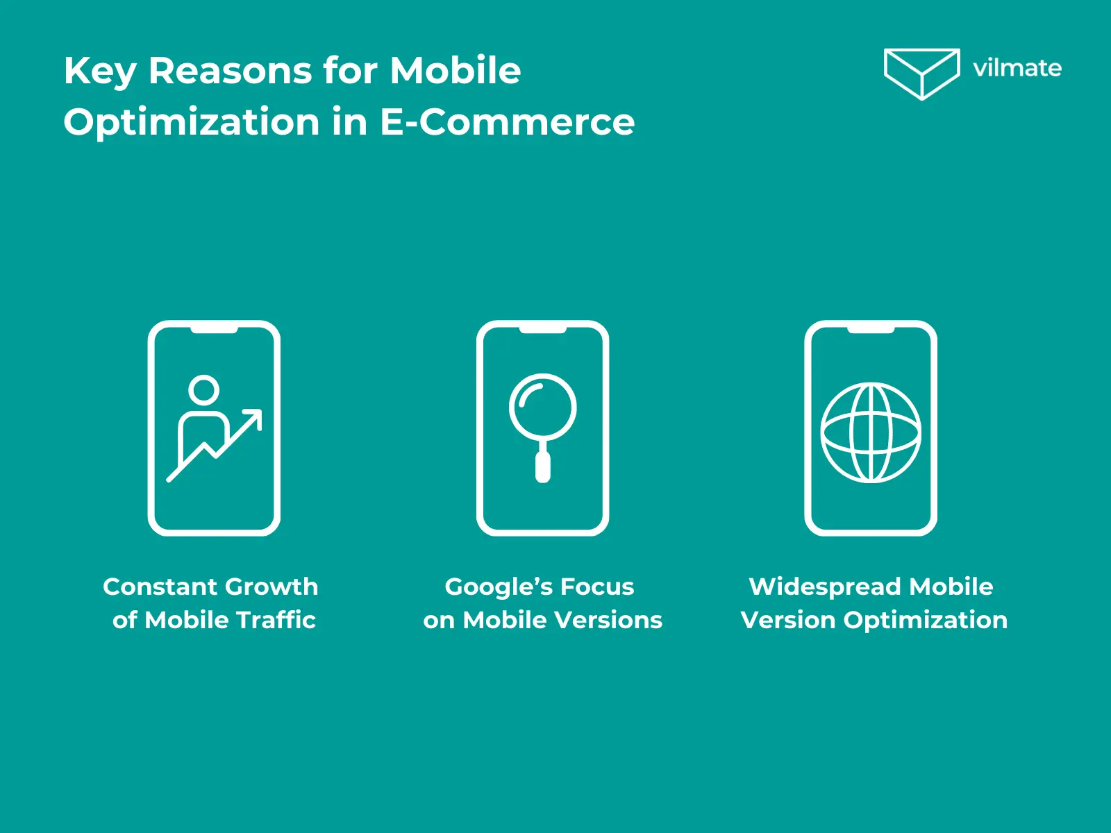
Mobile traffic has surpassed desktop traffic, and more people shop from their smartphones yearly. If your website isn’t mobile-friendly, you risk losing many potential customers. Let’s look at the key reasons why mobile optimization is critical for the success of an online store.
1. Mobile Traffic Keeps Growing
Most users search for products, read reviews, and place orders from their phones. According to Statista, nearly 80% of all retail website visits in 2024 came from mobile devices. Customers will go to a competitor if your site isn’t easy to use on a smartphone.
2. Google Prioritizes Mobile-Friendly Websites
Google and other search engines use mobile-first indexing. This means they rank websites based on their mobile versions first. If your site isn’t optimized for smartphones, its search rankings may drop, leading to less organic traffic and fewer customers.
3. Your Competitors Are Already Ahead
Leading retailers and marketplaces like Amazon, eBay, and AliExpress have long invested in mobile-friendly websites and apps to make shopping as smooth as possible. Seeing their success, most other retailers have followed their lead. Customers will choose a more manageable alternative if your site doesn’t meet modern usability standards.
Next, we’ll explore the key features that make an e-commerce website mobile-friendly.
Mobile vs. Desktop E-Commerce Website: What’s the Difference?
The goal of both versions is the same: making it easy for users to browse and buy products. However, mobile and desktop sites differ in technical setup and user experience (UX).
1. Screen Size and Content Layout
Desktop sites have more space, so menus, catalogs, and navigation elements can be larger and more detailed. However, the layout must be compact and responsive on mobile so everything fits nicely on smaller screens.
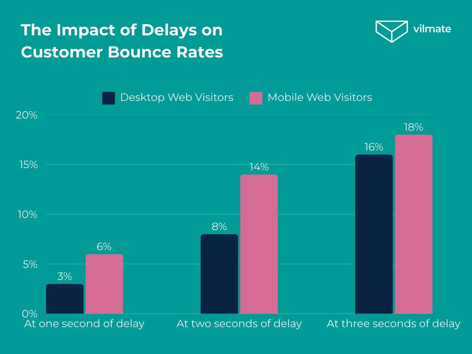
Mobile users often rely on mobile data, which can be slower than Wi-Fi. Large images, complex animations, and extra elements can slow down the site. Optimizing speed is key to a smooth mobile experience. Users don’t like to wait, and studies show that most will leave if a page takes more than 3 seconds to load.
3. Easy Navigation
On a desktop, users navigate with a mouse and keyboard. On mobile, they use their fingers, so buttons, forms, and links should be easy to tap without requiring perfect accuracy.
4. Search and Filters
On a desktop, filters can be displayed in a sidebar. On mobile, it’s better to hide them behind a “Filter” button and open them in a separate window to keep the screen uncluttered.
5. Checkout and Payments
Typing on a desktop is easy with a keyboard, but too much text input on mobile can be frustrating. Features like autofill, digital payments (Apple Pay, Google Pay), and social login make checkout much faster and easier.
Next, we’ll look at how to create a mobile e-commerce site that’s both user-friendly and effective.
Secrets of a Successful Mobile Version of an E-commerce Website
We’ve already discussed what features a mobile e-commerce website should have. Now, let’s focus on specific tips to help optimize it.
1. Choosing the Right Mobile Design
If a website isn’t convenient for mobile users, sales will suffer. That’s why the first step in optimization is selecting the correct type of mobile design.
There are two main approaches:
Responsive Design – The website automatically adjusts to different screen sizes, rearranging elements as needed. This is the most flexible solution and the one Google
Separate Mobile Version (m.site.com) – A dedicated website explicitly designed for mobile devices. The downside is that it requires maintaining two different sites.
The best choice is responsive design. It makes website management easier and improves SEO since Google prioritizes mobile-first websites.
Key Principles of Mobile Design:
Keep only the most important elements.
Use large fonts (at least 14px) for easy reading.
Ensure buttons and links are big enough to tap comfortably (44×44 px or larger).
Make sure content fits the screen – horizontal scrolling should be avoided.
2. Simple and Intuitive Navigation
When users visit a site, they have two goals: to find a product and complete the purchase. If navigation is complicated, they’ll leave.
Best Practices for Mobile Navigation:
Hamburger menu (☰ icon) – Saves space and keeps the screen uncluttered.
Limited number of menu items – Ideally, 5-7 main sections.
Icons for categories – Help users find what they need faster.
Sticky menu on scroll – Ensures the cart and search are always accessible.
3. Fast Search and Smart Filters
Search is one of the most important tools for mobile users. No one wants to scroll through endless product lists when they can type in a query.
Key Features of Mobile Search:
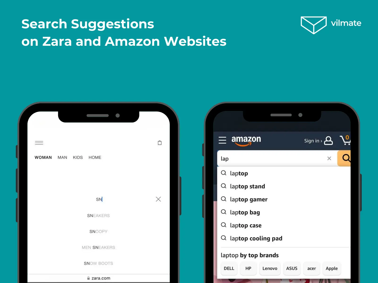
Autocomplete – Suggests popular search terms as the user types.
Error correction – Recognizes typos and suggests the correct words.
Filters and sorting – Designed for mobile screens, hidden behind a button, and opening in a separate window.
4. Optimized Product Pages
On a desktop, users can see all the details at once. On mobile, content needs to be well-organized for easy browsing.
Essential Elements of a Product Page:
High-quality images with zoom functionality.
Reviews and ratings are placed below the price, so users don’t have to search for them.
A large, noticeable “Add to Cart” button that’s easy to tap.
5. A Simple and Fast Checkout Process
The more complicated the checkout, the more likely users will abandon their purchase.
How to Make Checkout Easier:
Fewer required fields – Only the essentials (Name, Phone, Address, Payment).
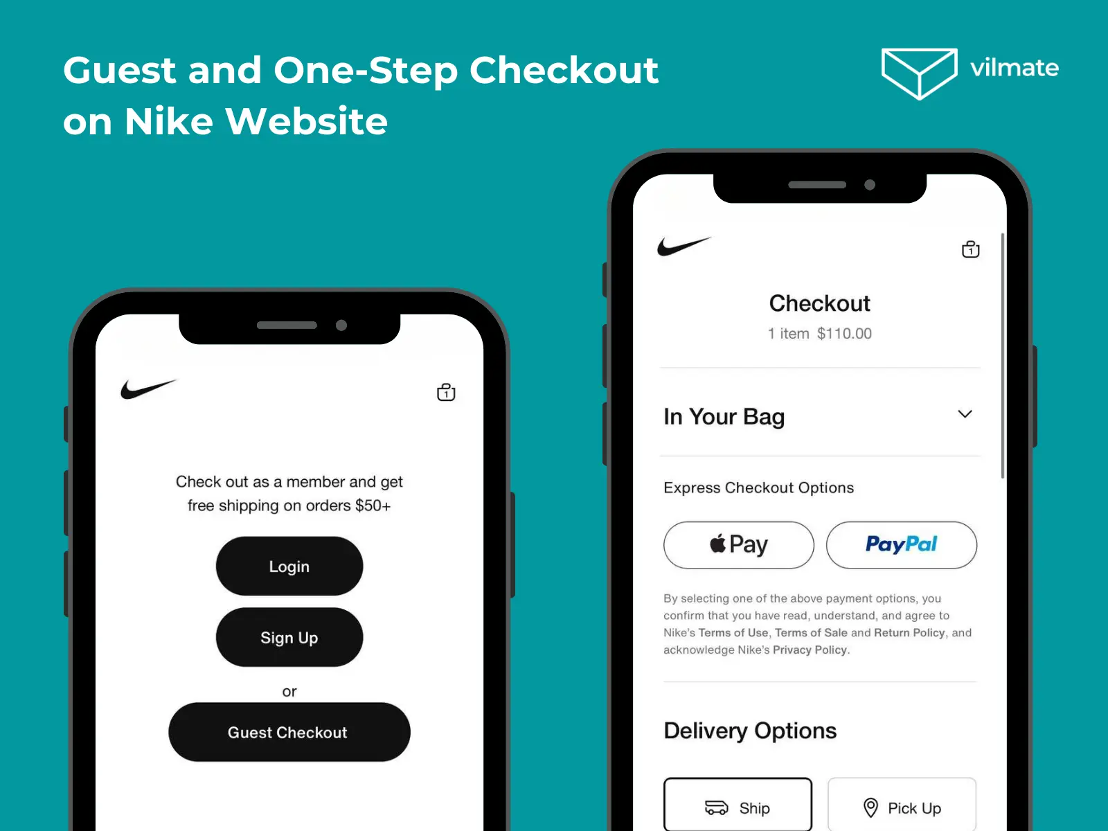
Guest checkout option – No need to create an account.
Autofill support – Speeds up form completion.
Multiple payment options – Google Pay, Apple Pay, and PayPal for faster transactions.
6. Fast and Lightweight Website (Loading Speed)
Website speed has a direct impact on conversions.
Ways to Improve Mobile Website Speed:
Compress images – Use WebP instead of JPEG to reduce file size.
Lazy loading – Load images only when they appear on the screen.
Minimize code – Remove unnecessary JavaScript and CSS.
Use AMP (Accelerated Mobile Pages) – A Google technology that speeds up page loading.
7. Easy and Fast Mobile Payments
The simpler the payment process, the higher the conversion rate.
Essential Payment Options:
Google Pay and Apple Pay – One-click payments for a seamless checkout.
Payments via messaging apps – Options like Telegram and WhatsApp.
QR code payments – Popular in many Asian markets.
8. Push Notifications and Personalization
Push notifications help bring customers back and increase sales.
Types of Effective Push Notifications:
Abandoned cart reminders – Encourage users to complete their purchases.
Promotions and discounts – Inform customers about special offers.
Personalized recommendations – Based on their browsing history.
Most online retailers use these simple strategies. However, new technologies can help businesses stand out even more. Let’s explore them next.
New Technologies in Mobile E-commerce: Enhancing the User Experience
Modern shoppers don’t just browse online stores on their phones—they expect a fast, intuitive, and seamless shopping experience. To meet these expectations, businesses must go beyond simply adapting their websites for mobile screens. They must integrate innovative technologies that anticipate customer needs and make online shopping even more convenient.
AI and Machine Learning: Smarter Personalization
Artificial Intelligence (AI) and Machine Learning (ML) are among the most significant advancements in the field. These technologies help online stores understand their customers better by analyzing their behavior and predicting their interests.
For example, if a customer frequently searches for sports shoes, AI can suggest sneakers in their preferred style and even recommend matching accessories. This personalization makes shopping easier and increases the chances of a purchase.
Voice Search: A Faster Way to Find Products
AI is also transforming site search. Basic keyword search is no longer enough—users want to search naturally, ideally by speaking instead of typing.
This is why voice search is becoming more common in mobile e-commerce. It’s especially useful when users have full hands or want to find a product quickly. Since mobile shoppers value speed and convenience, voice search helps them navigate online stores without extra effort.
AR: Bringing Products to Life
Another game-changing technology is Augmented Reality (AR). It allows shoppers to “try before they buy,” helping them feel more confident in their choices.
For example, IKEA lets users see how furniture would look in their homes. Some beauty stores offer virtual makeup try-ons, allowing customers to test lipstick or eyeshadow using their phone camera.
AR is especially helpful for mobile shoppers. Many of them shop on the go and hesitate before making a purchase. This technology removes doubts and makes the decision-making process easier.
Conclusion
Today, mobile e-commerce is more than just a website that works on a smartphone. It’s a fully optimized experience where navigation, speed, security, and modern technology all matter. Customers will quickly switch to a competitor if a mobile site is slow, inconvenient, or outdated.
At Vilmate, we know how to create a high-performing mobile version that meets industry standards and boosts sales. We can audit your mobile site, improve loading speed, enhance responsive design, and implement advanced technologies like AI. Contact Vilmate if you’re looking for expert help in optimizing your mobile e-commerce website.
AUTHOR BIO
Anastasiia Rezinkina
Copywriter / Content manager
Anastasiia is a content writer at Vilmate with a focus on e-commerce, AI, and emerging tech trends. She turns complex topics into clear, practical reads — whether it’s comparing CMS platforms or unpacking how AI is reshaping online retail.
If AI has suddenly become one more thing your retail team is expected to figure out, we get it. There are vendor demos, competitor launches, internal questions, and probably a few very confident opinions about what you should be doing already. That can make AI in retail feel like a decision you’re late to. You’re […]
Somewhere between a board meeting and an e-commerce roadmap, “we need AI” becomes a non-negotiable business requirement. The pressure is real. In Dataiku’s 2026 survey of 900 enterprise CEOs, 80% said their role could be at risk if their company failed to show measurable AI gains by year-end. These circumstances can move an AI project […]
An order splits into two shipments, and no system flags it in advance. The warehouse shows stock that’s actually gone. A customer returns one item out of three, and accounting still doesn’t see that the return ever happened. Support pulls up the customer’s record and can’t tell what stage the order is at—because that stage […]
Cookies help us see what's working on this site and make it better. Your call on what we track.
Functional
Always active
The technical storage or access is strictly necessary for the legitimate purpose of enabling the use of a specific service explicitly requested by the subscriber or user, or for the sole purpose of carrying out the transmission of a communication over an electronic communications network.
Preferences
The technical storage or access is necessary for the legitimate purpose of storing preferences that are not requested by the subscriber or user.
Statistics
The technical storage or access that is used exclusively for statistical purposes.The technical storage or access that is used exclusively for anonymous statistical purposes. Without a subpoena, voluntary compliance on the part of your Internet Service Provider, or additional records from a third party, information stored or retrieved for this purpose alone cannot usually be used to identify you.
Marketing
The technical storage or access is required to create user profiles to send advertising, or to track the user on a website or across several websites for similar marketing purposes.