Good interface design isn’t just about convenience – it’s one of the things that makes an online product competitive. In healthcare, though, the stakes are much higher: medical UX design can affect not only how easy a product is to use but also the health – and sometimes even the lives – of patients.
Nevertheless, UX design in healthcare is often still underestimated. In the US and EU, clunky digital tools and confusing interfaces cost the healthcare industry billions of dollars every year – and the numbers keep rising. Poor UX in healthcare is incredibly expensive, which is why investing in a user experience that truly works is not a luxury, but a must.
At Vilmate, we’ve worked on numerous healthcare projects and understand the unique and challenging nature of this field. In this article, we’ll talk about why healthcare UX can literally be a matter of life and death, how bad design leads to real losses, share examples of bad UX solutions, and show what makes a user experience not only effective, but also safe.
UX in Healthcare as a Safety Factor
In most digital products, poor UX results only in lower profits or the loss of customers. But when it comes to UX in healthcare, the cost of mistakes increases dramatically. Here, an inconvenient interface can do more than frustrate a user – it can directly threaten their health and even their life.
Historically, healthcare has been slower to adopt technology compared to other industries. Even within digital health, a significant lag remains. According to a Nuffield study, the healthcare sector trails other industries by at least a decade in terms of process digitalization. That’s why many systems still look and function as if they were designed decades ago — with outdated logic and little regard for user needs.
One of the most striking examples was the rollout of a new electronic health record (EHR) system by the US Department of Veterans Affairs in 2020. According to a 2022 report by the Office of Inspector General, the system failed to process over 11,000 clinical orders. Doctors were never notified: the interface did not indicate that the data had “stalled” and never reached the intended recipients. As a result, at least 149 cases of patient harm were documented, including one classified as severe.
This case highlighted that the issue was not only technical but also a design failure. Users had no way to see, interpret, or respond to critical information promptly. In other words, it was a weak medical UX that prevented physicians from recognizing that something had gone wrong in the system.
Stories like this are far from rare. Patients often get lost in apps and never receive their test results, doctors waste precious minutes searching for records, and nurses are forced to keep duplicate paper notes. All of these examples demonstrate how poor healthcare UX design can transform digital solutions into sources of risk rather than tools for care.
Well-designed UX for both doctors and patients, on the other hand, saves crucial minutes, reduces the likelihood of errors, and directly improves treatment quality. That is why UX design in healthcare is not just about convenience – it is a critical factor of safety.
Typical UX Mistakes in Healthcare
Stories about digital systems failing and putting patients at risk don’t just happen out of nowhere. Behind them are very real mistakes in healthcare UX design that keep repeating again and again. And these mistakes are exactly what can turn technology from a helper into a danger:
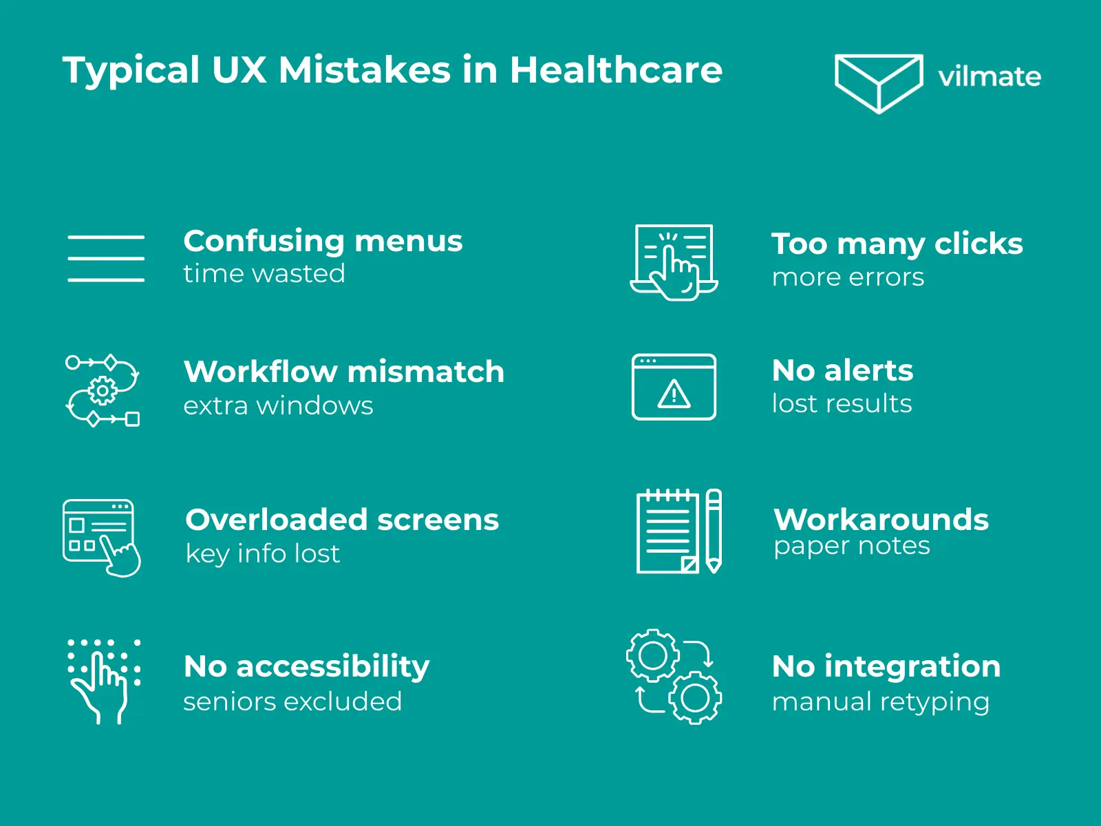
Complicated navigation and cluttered screens. A doctor wastes precious minutes digging through menus to find a patient’s history, while the patient keeps waiting.
Unclear statuses and missing alerts. A lab order gets “stuck,” but the system doesn’t say a word. The patient arrives for the results and learns there are none.
Too many clicks. Something as simple as writing a prescription takes five screens and dozens of clicks. By the end of the day, that’s hundreds of extra actions — and more chances to make mistakes.
Workflow mismatch. The interface doesn’t accurately reflect actual workflows, so physicians must open multiple windows to compare test results with prescriptions.
One-size-fits-all screens. Doctors, nurses, and patients all see the same overloaded interface. Each gets flooded with details they don’t need, and the important stuff gets lost.
Ignoring accessibility. Small fonts and low contrast make digital tools nearly impossible for elders to use. Without adjustments, many give up using them.
Poor integration. Scheduling, lab results, and billing systems often fail to communicate with each other. Doctors have to retype everything, and errors slip in.
Workarounds. To move faster, nurses jot notes on paper first, then enter them later. Under pressure, things get lost or recorded incorrectly.
At first, these might look like small annoyances. However, in reality, they slow down work, increase the likelihood of medical mistakes, and erode trust in the system.
The numbers speak for themselves. A 2023 study in JAMA Network Open showed that US primary care doctors spend over 4.5 hours a day on electronic health records — more than half of which is spent after hours.
Leaders see the problem too. In a 2024 Juno Health survey, EHR usability was named as the top IT pain point — even bigger than AI or telemedicine. And it’s easy to see why: when systems are hard to use, everything slows down — staff training, compliance, and even the efficiency of the entire clinic.
And there’s also money at stake. Every extra click, every repeated patient visit, every wasted hour of manual work translates into direct costs. This brings us to a bigger question: how does poor healthcare UX ultimately end up costing billions?
Financial Losses Caused by Poor UX in Healthcare
When UX mistakes in healthcare put lives at risk, there is another painful consequence — a massive loss of money. According to Black Book Research, the US healthcare system loses more than $8 billion annually due to inefficient digital systems. Back in 2017, that number was “only” $1.7 billion. The message is clear: the cost of poor healthcare UX is skyrocketing.
The trouble is that every tiny inconvenience in an interface multiplies across thousands of staff and millions of patients. That’s how small design flaws turn into huge financial drains:
Doctors’ and nurses’ time wasted. Extra clicks, long forms, and overloaded screens eat into productivity. Add just five extra minutes per patient — and across a clinic, that means thousands of hours of unpaid or overtime work.
Workarounds everywhere. Staff often keep double records in Excel, notebooks, or even on scraps of paper. It slows them down, creates mistakes, and incurs extra costs to fix and recheck everything later.
Training that never ends. Complicated interfaces mean that every new hire requires lengthy and costly training. The clunkier the system, the more expensive it is to onboard — sometimes millions wasted each year.
Support and redesign bills. Bad UX triggers constant complaints. Instead of moving forward, companies get stuck spending on patching up design issues and endless interface “fixes.”
Legal risks. If a confusing interface leads to a medical error, clinics face lawsuits. Settling those cases can cost as much as the system itself.
Losing patients and revenue. When telemedicine apps, online booking, or mobile tools are frustrating to use, patients simply stop using them. They go elsewhere, and the clinic loses income.
In short, poor UX in healthcare doesn’t just frustrate people — it drains billions from the system. But numbers alone can feel abstract. The reality hits harder when you see real-life interfaces that fall short for both doctors and patients. Next, we’ll walk through those examples to illustrate the true cost of ignoring UX.
Examples of Poor UX in Healthcare
Numbers and reports reveal the scale of the problem, but it becomes much clearer when you examine real interfaces. The screenshots below illustrate common examples of failed healthcare UX design, including overloaded forms, unclear priorities, confusing navigation, and screens that are difficult to process.
What all of them have in common is simple: these systems don’t help doctors and patients — they get in their way. Instead of simplifying tasks and speeding up the process, they introduce new risks and errors.
To understand how to avoid these traps, it’s essential to examine the opposite side — what good UX design for healthcare should look like, the kind that truly makes work easier and care safer.
What Good UX in Healthcare Looks Like
Good healthcare UX design is not just about “convenient buttons” or a nice-looking screen. In medicine, it’s a matter of trust, safety, and efficiency. Systems must support doctors and patients, not create new risks.
Key principles of effective UX in healthcare include:
User-centered design. Interfaces are built around real workflows of doctors, nurses, and patients. Users are involved early on, prototypes are tested, and barriers are removed before launch.
Clear navigation. Minimal extra steps, logical structure, and quick access to critical information.
Effective data visualization. Charts, dashboards, and risk indicators that let a doctor assess a patient’s condition in seconds.
Standardization and consistency. A unified interface language: consistent buttons, forms, and icons so users don’t get lost moving between modules.
Accessibility and inclusivity. Fonts, color choices, and navigation elements are designed to accommodate the needs of elders and individuals with disabilities.
Transparency and safety. Clear statuses, alerts, and error messages. Users should always be aware of what has happened and what to do next.
Continuous improvement. Regular feedback from doctors and patients, ongoing testing, and updates based on real-world use cases.
When interfaces are built on these principles, they cease to be obstacles and become tools that support healthcare professionals and enhance the quality of care.
And to see how this works in practice, you only need to look at strong interface examples — they prove that healthcare UX can be not only safe, but also intuitive, modern, and pleasant to use.
Conclusion
Bad UX in healthcare is never just about awkward screens — it’s about real people losing time, making mistakes, or not getting the care they need. Good UX, on the other hand, makes things clearer, faster, and safer for everyone involved.
At Vilmate, we believe technology in medicine should feel like support, not an obstacle. That’s why we design healthcare solutions that doctors and patients actually want to use — turning complex processes into simple, reliable tools that make a difference every day.
AUTHOR BIO
Anastasiia Rezinkina
Copywriter / Content manager
Anastasiia is a content writer at Vilmate with a focus on e-commerce, AI, and emerging tech trends. She turns complex topics into clear, practical reads — whether it’s comparing CMS platforms or unpacking how AI is reshaping online retail.
For most private clinics, digital transformation in healthcare has quietly turned from a nice idea into a survival question. It’s not about following trends – it’s about keeping patients, doctors, and processes in sync. Patients now expect the same simplicity they get from any other service: book an appointment online, get test results without calling […]
Technology is quietly changing the way healthcare works. What once took endless paperwork and phone calls now happens inside healthcare software – from patient scheduling and billing to secure data management and modern telehealth software solutions. These digital tools have made medicine faster, more organized, and in many ways, more accessible. Still, if you ask […]
Starting a healthcare startup is exciting, but it can also be overwhelming. You’re dealing with patient privacy, strict rules like HIPAA and GDPR, and the challenge of integrating with hospital systems that often feel far from modern – all while investors push for quick results. Many founders encounter the same problem: work is split between […]
Cookies help us see what's working on this site and make it better. Your call on what we track.
Functional
Always active
The technical storage or access is strictly necessary for the legitimate purpose of enabling the use of a specific service explicitly requested by the subscriber or user, or for the sole purpose of carrying out the transmission of a communication over an electronic communications network.
Preferences
The technical storage or access is necessary for the legitimate purpose of storing preferences that are not requested by the subscriber or user.
Statistics
The technical storage or access that is used exclusively for statistical purposes.The technical storage or access that is used exclusively for anonymous statistical purposes. Without a subpoena, voluntary compliance on the part of your Internet Service Provider, or additional records from a third party, information stored or retrieved for this purpose alone cannot usually be used to identify you.
Marketing
The technical storage or access is required to create user profiles to send advertising, or to track the user on a website or across several websites for similar marketing purposes.